In collaboration with the in-house team at Lighthouse—Scotiabank’s internal creative agency—we developed a brandmark for Scotia Perks, a new program that goes beyond rewards. As a brand extension, Scotia Perks is designed to deliver memorable experiences to the bank’s most valuable asset: its customers.
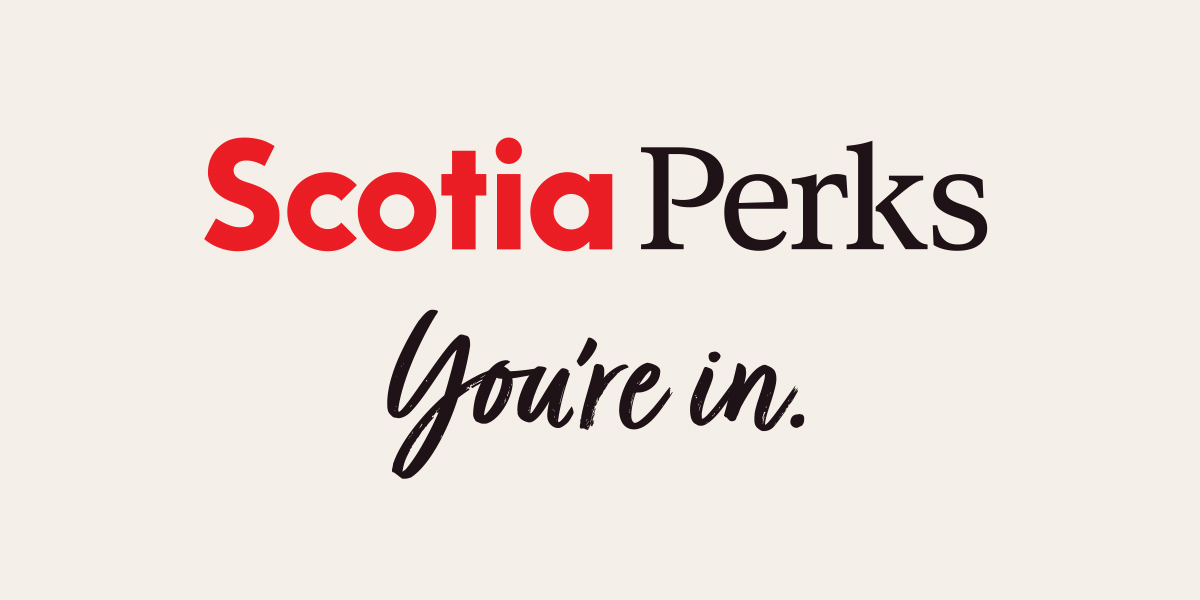
The design process began with an exploratory phase focused on creative directions rooted in the program’s name and core value proposition: as a Scotiabank customer, you’re in. Concepts around membership, exclusive access, and curated experiences resonated well—but it quickly became clear that adding a more personal, human touch would set the tone.
To bring that warmth forward, we introduced a handwritten script font for the tagline You’re in., creating an expressive and welcoming layer within the identity. The wordmark itself followed Scotiabank’s global brand framework, pairing the Scotia Serif font with the Scotia wordmark. The result: a clean, sophisticated look that balances brand consistency with a fresh, elevated feel.
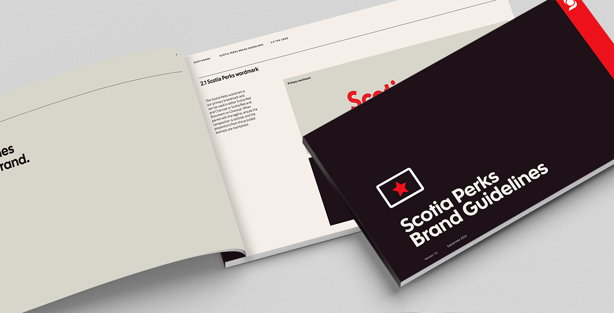
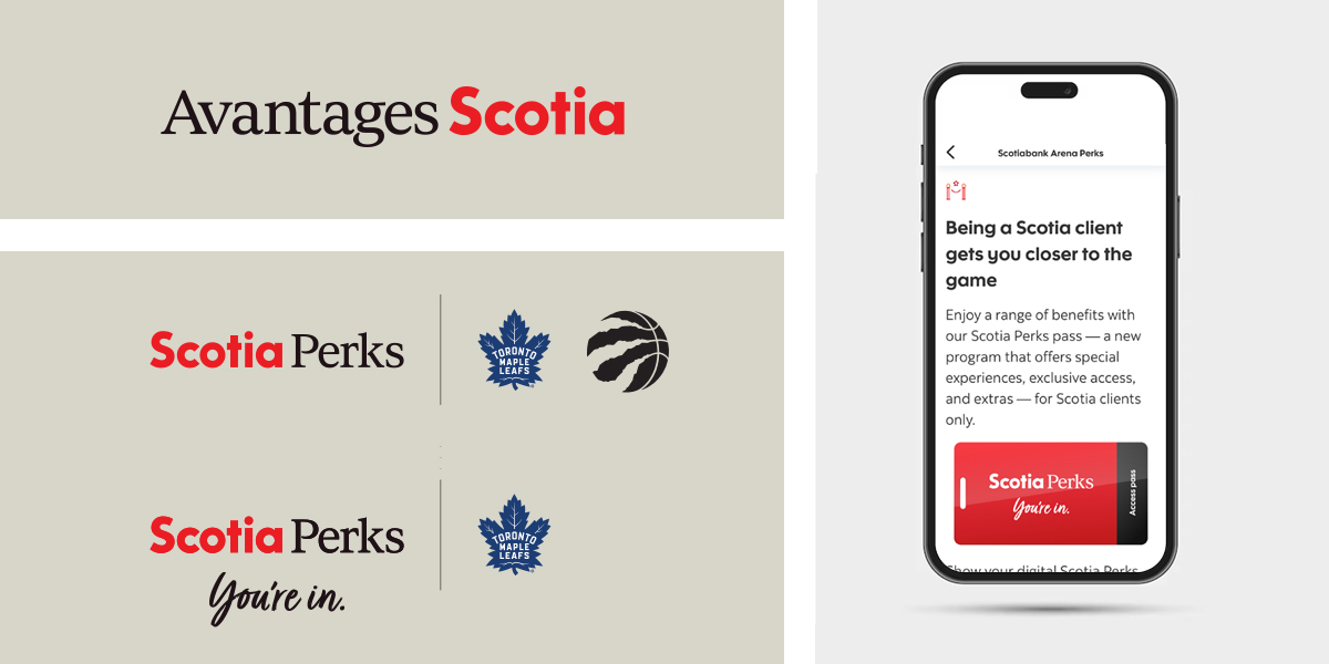
The new identity was also designed with bilingual functionality in mind and adapted seamlessly in French. A full set of brand guidelines was developed to ensure consistent application across channels and owned assets—an important consideration given the program’s key co-branding partnerships.
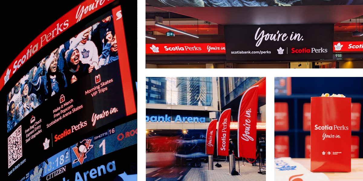
Activation ideas brought the brand to life in engaging ways, inspiring a sense of belonging and celebration that helped shape the launch campaign. Centered on Scotiabank’s partnership with MLSE, the launch focused on the premium experiences available to Scotia Perks members at Scotiabank Arena during Toronto Maple Leafs home games.
In-situ images by LH.
Read Less