CASCO’s Brand Identity for a Family Law Firm signifies Fairness and Equality

Context
Watson is a boutique law firm exclusively practicing family law. They represent clients needing guidance and resolution on parenting, child and spousal support, equalization and division of property issues and domestic contracts. In preparation to launch the new firm, Watson commissioned CASCO to develop their brand identity.
Methodology
At CASCO, we start every project by taking a close look at the client’s business to understand its goals and objectives. After interviewing the client to understand their background and business, we establish a strategy and then proceed with the design process.
Having gained an understanding of Watson Family Law‘s offering, we sketched out dozens of logo ideas to find a unique opportunity to create a mark that would align with the strategy and lay the foundation for a creative platform we could expand upon. We presented two creative directions to the client entailed introducing them to our design process, our thinking and conclusions that we had reached.

One out of the two creative directions provided was highly personalized and based on the client’s own art, but it was later determined that the design element being considered could have been interpreted, in what one could say, as inappropriate. The client was happy to select the second option we had provided based on best fit for how the firm was to be positioned and also what felt like a natural solution.
Result
The mark puts a visual emphasis on the ‘O’. When seeing the ‘gap’ as a ‘split’, this symbolizes fairness and equality in separations. The ‘facing’ sides of the ‘O’ also symbolizes two parties pursuing a fair resolution.
CASCO selected the Avenir font for its clean and uniform makeup. Slightly customized to add uniqueness to the mark, the use of capital letters speaks to the experience and confidence one can expect from the firm’s team. Kelly green, complemented by a lime green, helps express new beginnings.
The stationery set features a playful placement of the ‘split’ mark. The business card features a foil stamp placed on a debossed mark. CASCO designed environmental graphics using a ‘tone-on-tone’ acrylic wall-mount sign, giving the space a welcoming yet confident look. Beautiful Knoll furniture complements the branding and brings the space to a new level.

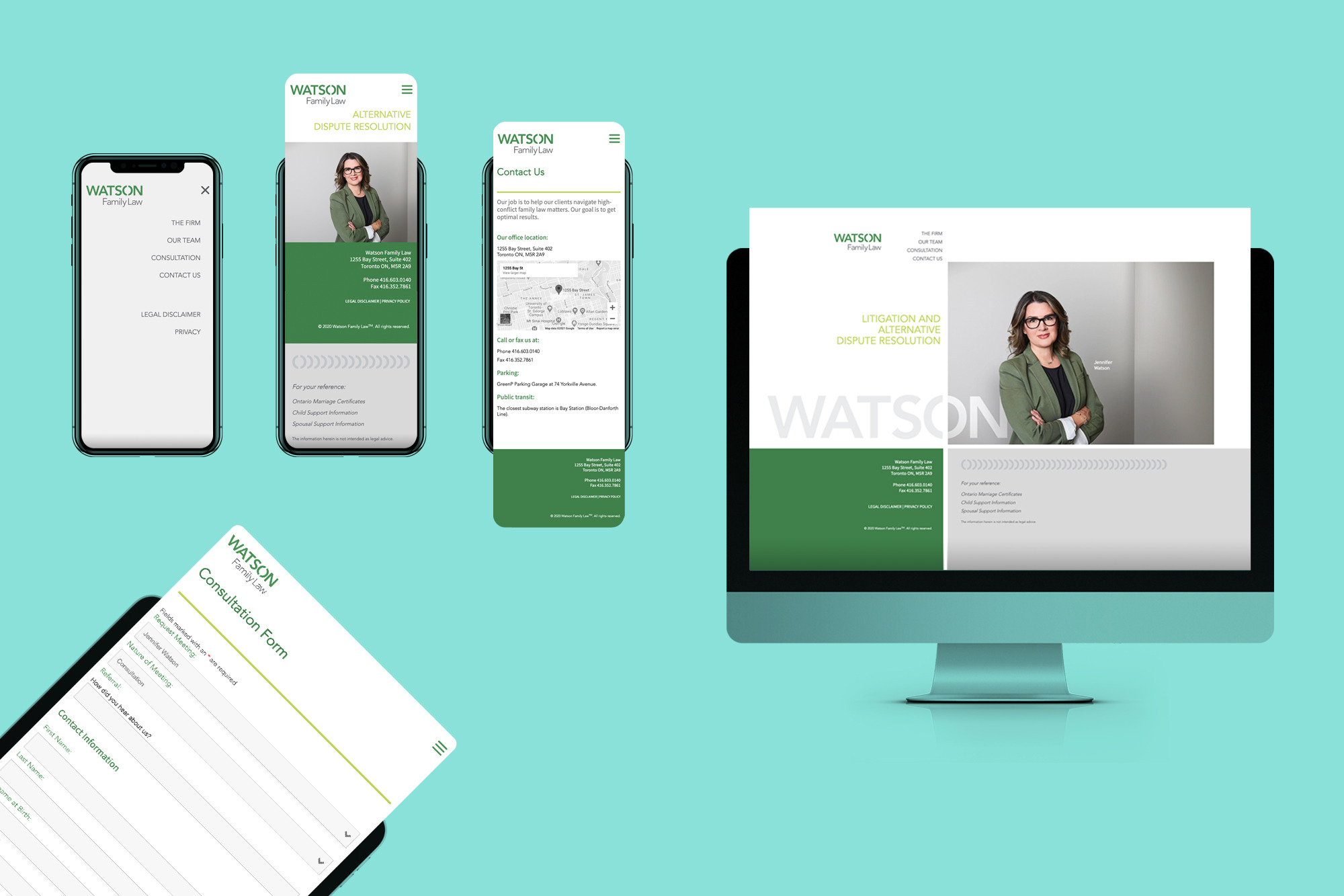
We also planned, designed and developed a new website for the firm.